San Diego Football Club
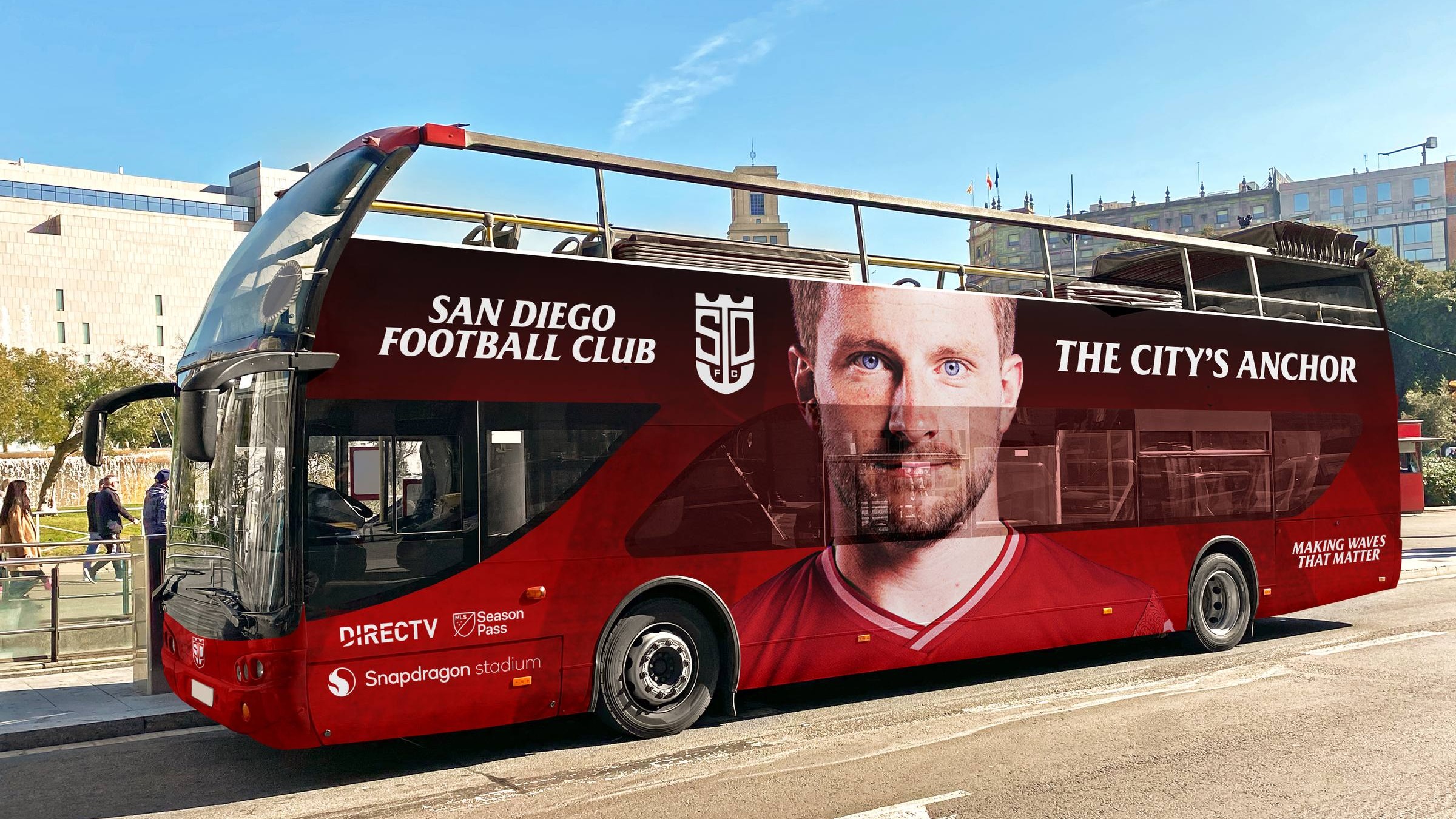
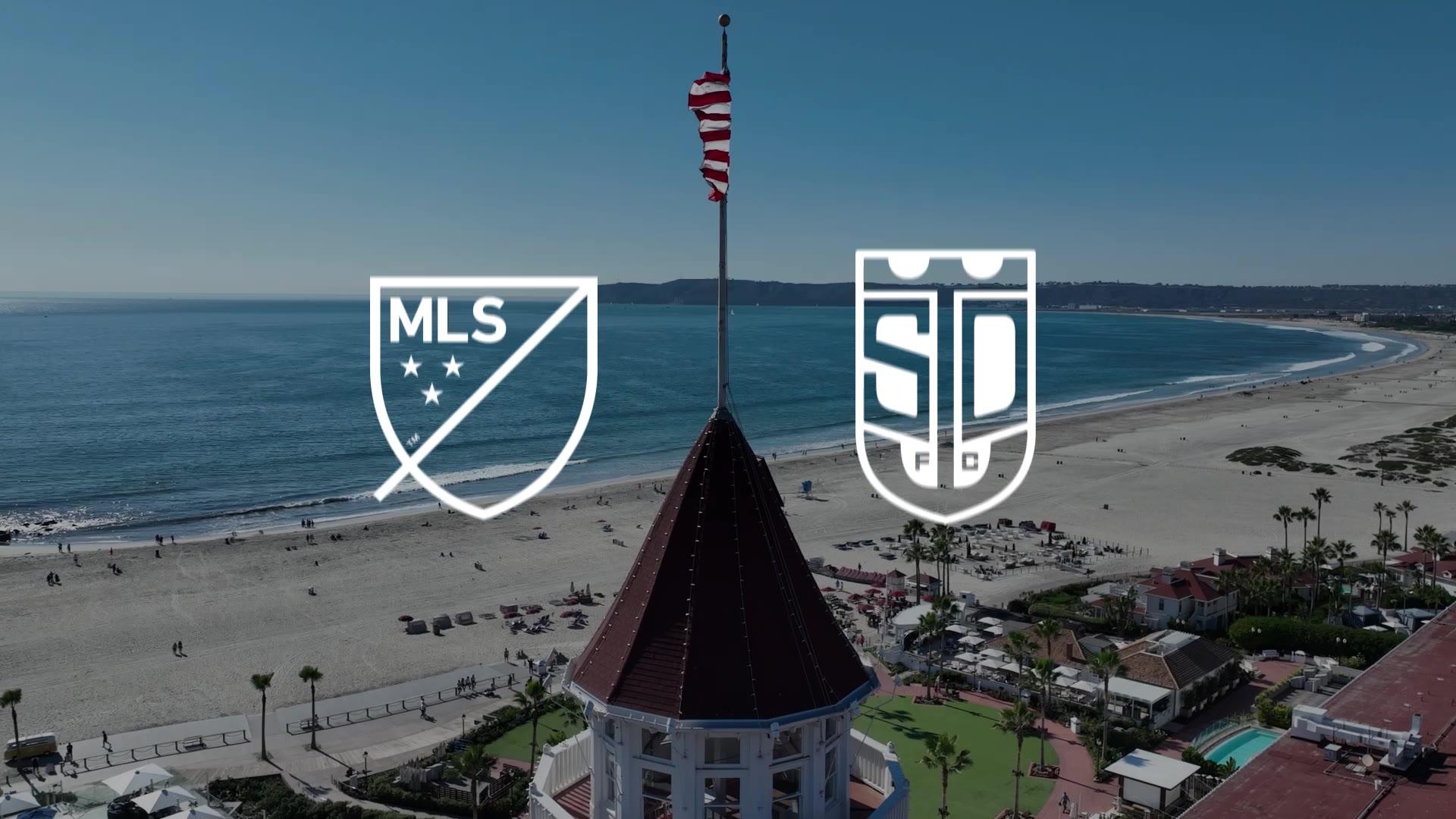
This proposed rebrand of San Diego FC was developed for the club’s inaugural season, building a bold, cinematic identity rooted in the character and history of San Diego. The crest combines mission-inspired arches, a shield-shaped outline, and a custom anchor, all designed to symbolize the city’s architecture, proximity to the Pacific coastline, naval heritage, and military community.
The visual and promotional language is built around fan engagement and positive mantras and slogans such as “The City’s Anchor,” “Our Strength, Our Anchor,” and “Making Waves That Matter.” The rebrand embraces the energy of the team and its supporters, intentionally moving away from the increasingly corporate design and language of modern sports in favor of something bold, local, and community-driven.
- Oversight
- Pamela Olecki
Associate Professor, ArtCenter College of Design
San Diego Seahorses
A proposed youth extension of San Diego FC, the San Diego Seahorses is a U-14 soccer team sponsored by SDFC and designed with a complementary visual identity. The program creates a professional, branded environment for young players to develop their skills while providing SDFC with a meaningful opportunity to engage with and invest in the youth of the San Diego community, working alongside a generation that can grow with the club.